Messing about with X windows
I've spent the last week or so adding bindings to kin for X11 and anti-grain geometry.
X11 gives basic windowing capability, but no widgets ( you run GTK or some other toolkit on top ), AGG gives high-quality software graphics rendering.
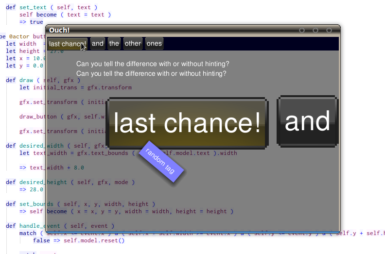
This is a window which attempts to draw some buttons:

The window has a transparent background. I've lost track of the number of hacks I've had to do to get transparent backgrounds working in either MFC or Java over the years ( though both now support them ), so making it happen out the box is nice. Just use a colour with a alpha less that 0xff, and the background is transparent.
Thanks to AGG, all the rendering has affine transformations applied to it; the code draws the buttons where they should be, then bigger for debugging, then messes around with rotated text and shading. It's shown running on top of SciTE, the editor I use.
The buttons are all drawn manually - currently the graphics class supports fill rectangles with colours, linear gradients or radial gradients, drawing text and finding the bounding box of text.
The code implements a tiny button_model/button_presenter.
The reason I posted now is that I realised this line of code does the most of the work of the horizontal box layout in Java Swing:
fold ( ( x, btn ) => btn.set_bounds ( x, 0.0, btn.desired_width ( gfx, `normal ), btn.desired_height ( gfx, `normal ) ).x + btn.width + 4.0, 0.0, buttons )
Having done far too much Swing programming, I often find that with what I'm trying to do with it there's nothing that fits. For example, last contract I was trying to make a nice split button with a menu, and the look and feel/ Swing component / MVC distinction meant that you couldn't reliably implement one that was both pluggable and looked good - either you built one out of two buttons, which didn't look or feel like one button with a split, or you did an owner draw and lost the pluggable look-and-feel. That contract also required a column based layout, and containers which lined up like tables - the normal typographic idioms. The intention is that kin's toolkit will be more typographic/infographic in style, rather than widgety - most of the time, it's for reading not clicking.
I'm quite happy that starting from X11 in C rather than with a toolkit such as GTK ( which again may get transparent backgrounds soon ), after a few days there's enough there to see that it'll be much easier to create your own application-specific toolkits.
Labels: graphics, kin, programming

